Website UX Audit: A Practical Guide for Business Owners
Website UX Audit: A Practical Guide for Business Owners

A website UX audit is a structured evaluation of how well your site supports user goals, identifies friction points, and converts visitors into customers. The industry standard term is “usability evaluation,” and professionals use it interchangeably with UX audit across frameworks like Nielsen’s 10 heuristics. A basic self-audit using a 12-point rubric takes approximately 15 minutes and tells you whether a full external audit is even necessary. Wallandfifth runs these evaluations as part of every product design engagement, because a site that looks good but performs poorly is a business problem, not just a design one.
What methods are used in a website UX audit?
A UX audit is best understood as an umbrella term covering several distinct evaluation methods, each suited to a different layer of the user experience. Product teams that treat it as a single checklist miss the depth that makes audits genuinely useful.
The four core methods are:
-
Heuristic evaluation. An expert reviews your site against Nielsen’s 10 heuristics, which include system status visibility, error prevention, and aesthetic minimalist design. A manual review of a single website takes experts 2–4 hours. Automated tools can analyze a URL against the same heuristics in minutes, making them useful for a first pass before committing to a full review.
-
Usability testing with real users. This method places actual users in front of your site and observes where they struggle. It captures behavioral data that heuristic evaluation cannot, including hesitation, confusion, and emotional response. Heuristic evaluation identifies obvious rule-breaking; usability testing explains why users still fail even when the rules are followed.
-
Analytics review. Behavioral data from tools like Google Analytics or Hotjar shows where users drop off, which pages have high exit rates, and which CTAs get ignored. Analytics tells you what is happening. It does not tell you why.
-
Self-audit using a structured rubric. A 12-point self-audit covers visual hierarchy, copy clarity, CTAs, mobile usability, and page speed. It takes 15 minutes and produces a score that guides your next decision.
A layered audit approach is the most effective structure: start with accessibility and core functionality, move to pragmatic usability, and finish with experiential and emotional assessment. Each layer uses different evaluation methods matched to what you are trying to measure.
Pro Tip: Run the self-audit before booking an external consultant. If your score is above 18/24, you likely need minor tweaks, not a full redesign. That 15-minute exercise can save you thousands in unnecessary consulting fees.

How to prioritize and interpret findings from a UX audit
Audit findings are only useful when you know which ones to fix first. The self-audit scoring system gives you an immediate decision framework: a score below 12/24 signals structural homepage problems that require a rewrite, while scores between 12 and 18 call for targeted tweaks, and scores above 18 indicate the site is performing adequately.
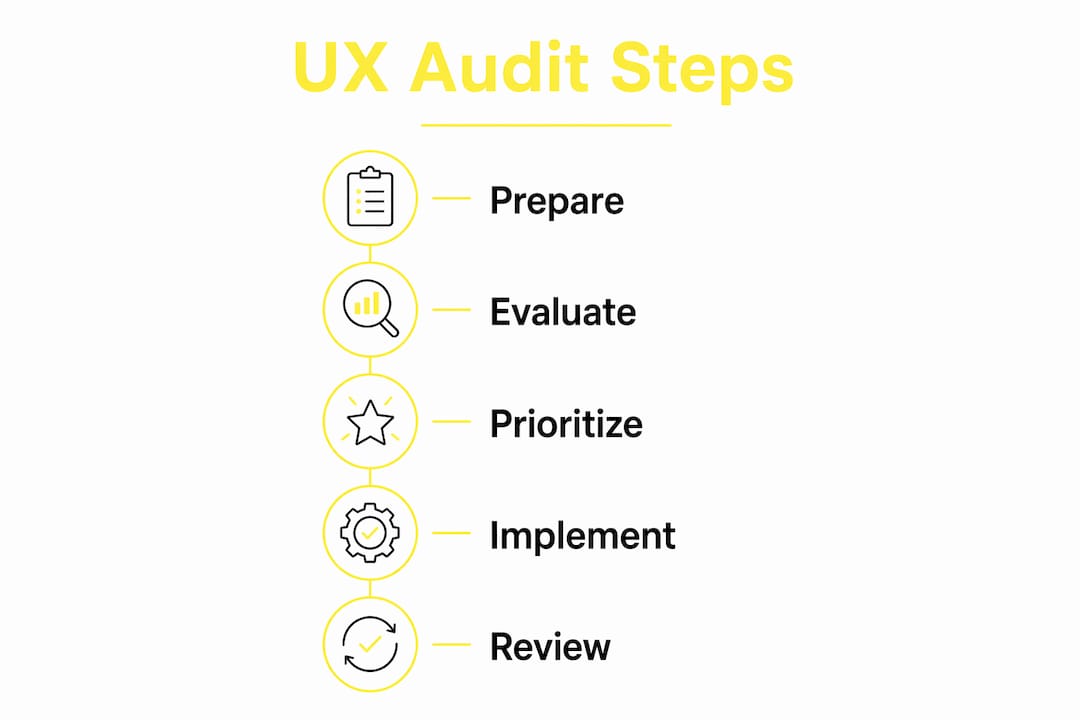
For heuristic evaluations, prioritization depends on two factors: severity and frequency. A severe issue that affects every user on every page ranks above a minor issue that appears once in the checkout flow. Evaluators typically rate severity on a 0–4 scale, where 4 is a usability catastrophe and 0 is a cosmetic disagreement.
Use this framework to organize your findings:
| Finding | Severity | Effort to fix | Priority |
|---|---|---|---|
| No visible CTA above the fold | High | Low | Fix immediately |
| Confusing navigation labels | High | Medium | Fix this sprint |
| Inconsistent button styles | Low | Low | Fix when convenient |
| Slow page load on mobile | High | High | Plan and resource |
| Missing error messages on forms | Medium | Low | Fix immediately |
Behavior data combined with user feedback gives you the full picture needed to prioritize correctly. Analytics shows what users do; attitudinal data explains why they do it. Relying on one without the other produces a prioritized list that fixes the wrong things.
Quick wins to address first:
- Page speed issues, since slow load times affect every single visitor
- Missing or unclear CTAs, which directly suppress conversion
- Broken mobile tap targets, where a minimum 44pt tap target prevents mis-tapping on smartphones
- Copy that does not match what users expect to find on a given page
Deeper structural problems, such as a confusing information architecture or a checkout flow with too many steps, require more planning. Do not let the complexity of those fixes delay the quick wins.
What are the common pitfalls and limitations of UX audits?
Heuristic evaluation is fast and cost-effective, but it has real limits. Experts identify rule violations, not user feelings. A site can pass every Nielsen heuristic and still frustrate users because the content does not match their mental model or the tone feels wrong for the audience.
“Heuristic evaluation is a form of discount usability. It catches obvious design mistakes quickly and cheaply, but it cannot replicate the nuanced behavioral and emotional data that comes from watching real users interact with your product. Pair it with moderated usability testing to get the full picture.”
— UX Academy London
The specific risks to watch for:
- False positives. An evaluator flags something as a usability problem that real users never notice or care about. This wastes development time on non-issues.
- Evaluator skill dependency. The quality of a heuristic evaluation depends entirely on the evaluator’s experience. A junior reviewer will miss issues that a senior practitioner catches immediately.
- Missing emotional context. Audits do not capture frustration, trust, or delight. A user might complete a task successfully and still leave with a negative impression of your brand.
- Mobile blind spots. Many audits focus on desktop and treat mobile as an afterthought. Given that mobile accounts for the majority of web traffic, this is a significant gap.
The fix is straightforward: treat heuristic evaluation as the starting point, not the conclusion. Use it to identify obvious problems quickly, then use moderated usability testing to validate findings and uncover what the audit missed.
How can businesses apply UX audit insights to improve conversion?
Audit findings without a clear implementation plan produce no results. The most effective approach is iterative: fix the highest-priority issues first, measure the impact, and then move to the next tier. This prevents the common mistake of attempting a full redesign when targeted fixes would have achieved the same outcome faster and at lower cost.
Post-audit, track these UX quality metrics to measure whether your changes are working:
- Task completion rate. The percentage of users who successfully complete a defined goal, such as submitting a contact form or completing a purchase.
- Error rate. How often users make mistakes during key flows. A drop in error rate after a fix confirms the change worked.
- Navigation discoverability. Whether users can find key sections without using search or the back button.
- User satisfaction scores. Collected via post-task surveys or tools like the System Usability Scale (SUS).
- Feature adoption. Whether users are engaging with functionality you have built and invested in.
Conversion optimization is the natural follow-up to a UX audit. Once friction points are removed, conversion rate improvements follow. Wallandfifth delivered exactly this sequence for busesforsale.com: a two-week audit, followed by a conversion optimization run and a full web design revamp. The audit created the evidence base; the redesign acted on it.
Aligning your product, marketing, and design teams around audit findings is also critical. Audit results often reveal that marketing is driving traffic to pages that UX has identified as broken. When both teams see the same data, prioritization becomes a shared decision rather than an internal argument.
Pro Tip: Schedule a UX review every six months, not just after a redesign. User expectations shift, new devices emerge, and content changes accumulate. A site that passed its audit in January can develop significant usability debt by July without a single intentional design change.
For teams considering a UX and UI design partner, the audit phase is where the most important decisions get made. Getting that phase right determines whether the subsequent design work solves the actual problem or just makes the site look different.
Key Takeaways
A website UX audit is most effective when it combines heuristic evaluation, analytics review, and real user testing, then prioritizes fixes by severity and conversion impact.
| Point | Details |
|---|---|
| Start with a self-audit | A 15-minute, 12-point rubric tells you whether a full external audit is needed before spending budget. |
| Use layered evaluation methods | Combine heuristic review, analytics, and user testing to capture behavior, rule violations, and emotional response. |
| Prioritize by severity and effort | Fix high-severity, low-effort issues first to get measurable results without waiting for a full redesign. |
| Track UX quality metrics post-audit | Measure task completion, error rates, and satisfaction scores to confirm that fixes actually improved performance. |
| Treat audits as ongoing practice | Schedule reviews every six months, since usability debt accumulates even without intentional design changes. |
What I have learned from running UX audits on real products
The most common mistake I see is treating a UX audit as a one-time event tied to a redesign. Business owners commission an audit, act on the findings, launch the new site, and then assume the work is done. Six months later, the site has drifted. New content has been added without UX review, the mobile experience has degraded, and conversion is sliding again.
The second mistake is skipping the self-audit entirely. Founders often go straight to an external consultant because they assume the self-assessment is too basic to be useful. It is not. A 15-minute structured review forces you to look at your own site the way a stranger would. That alone surfaces problems that internal teams have become blind to.
What actually works is a layered approach: self-audit first, heuristic evaluation second, analytics review third, and user testing fourth. Each layer builds on the last. You do not need all four every time, but you do need to know which layer your current problem sits in before you choose a method.
The one thing I would push back on is the idea that audits are primarily a design tool. They are a business tool. The findings from a good conversion optimization audit directly inform product roadmap decisions, marketing spend, and sales messaging. When you treat audit results as business intelligence rather than a design to-do list, the entire organization uses them more effectively.
— William
Wallandfifth’s approach to UX audits and product design
If your site is underperforming and you are not sure whether the problem is design, copy, structure, or something deeper, a structured audit is the right starting point.

Wallandfifth works with founders and product managers to run layered UX evaluations that go beyond surface-level checklists. The process covers heuristic review, analytics interpretation, and conversion analysis, producing a prioritized list of fixes with clear business rationale behind each one. For teams that need more than findings, Wallandfifth also handles the redesign and build. Explore the product design consulting service to see how a structured audit fits into a full product improvement engagement.
FAQ
What is a website UX audit?
A website UX audit is a structured evaluation of how well a site supports user goals, identifies usability problems, and converts visitors. It typically combines heuristic evaluation, analytics review, and user testing.
How long does a UX audit take?
A basic self-audit using a 12-point rubric takes approximately 15 minutes. A manual heuristic evaluation by an expert takes 2–4 hours, while automated tools can produce a high-level analysis in minutes.
What score on a self-audit means I need a full redesign?
A score below 12/24 on the standard self-audit rubric indicates structural homepage problems that require a rewrite. Scores between 12 and 18 call for targeted tweaks, and scores above 18 suggest the site is performing adequately.
Can a UX audit replace usability testing with real users?
No. Heuristic evaluation identifies rule violations quickly, but it cannot capture actual user behavior or emotional response. Pairing an audit with moderated usability testing gives you the complete picture.
What metrics should I track after a UX audit?
Track task completion rate, error rate, navigation discoverability, user satisfaction scores, and feature adoption. These metrics confirm whether your post-audit fixes produced measurable improvements in user experience.
Recommended
- UX & UI Design Partner for Digital Businesses | Wall & Fifth | Wall & Fifth
- Product Design Consultant for Digital Ventures | Wall & Fifth | Wall & Fifth
- Conversion Optimisation Partner for Digital Businesses | Wall & Fifth | Wall & Fifth
- Website Design Partner for Ambitious Businesses | Wall & Fifth | Wall & Fifth