What Is a UX Audit? A Guide for Product Teams
What Is a UX Audit? A Guide for Product Teams

A UX audit is defined as a systematic, expert-led evaluation of a digital product that identifies usability flaws, accessibility gaps, and friction points hurting conversion and user satisfaction. The process is diagnostic, not prescriptive. It tells you what is broken and why, without delivering a redesign. For entrepreneurs and product managers, this distinction matters enormously. A well-executed audit gives you evidence-backed priorities, not a list of opinions. It connects user behavior directly to business outcomes, making it one of the most cost-effective tools available for improving a digital product.
What is a UX audit and how does it differ from a redesign?
A UX audit is a structured review of how well a digital product serves its users, measured against established usability principles and real behavior data. The industry also calls this a usability audit or UX evaluation, and the terms are interchangeable in practice. What separates it from a redesign is scope. An audit diagnoses. A redesign treats.
Every recommendation in a credible audit must connect to a specific usability problem affecting a measurable KPI, such as conversion rate, bounce rate, or task completion. That constraint keeps the process objective. Without it, audits drift into subjective design preferences, which are far less useful to a product team.

The concept of UX debt is central to understanding why audits matter. UX debt accumulates as products scale, through inconsistent design patterns, accessibility shortcuts, and features added without proper user testing. Left unaddressed, it erodes user trust and satisfaction over time. An audit is the tool you use to measure and prioritize that debt before it becomes a conversion problem you cannot explain.
How does a UX audit work?
The methodology behind a UX audit combines heuristic analysis, analytics review, and, when resources allow, usability testing. Heuristic analysis is prioritized over usability testing in most audits because it is faster and covers more ground. An expert evaluates the product against established design principles, such as Jakob Nielsen’s 10 usability heuristics, identifying violations that create friction for users.
Analytics review adds the data layer. Auditors examine metrics like drop-off rates, session recordings, heatmaps, and funnel data to confirm where users are struggling. This combination of expert judgment and behavioral data produces findings that are hard to argue with in a stakeholder meeting.
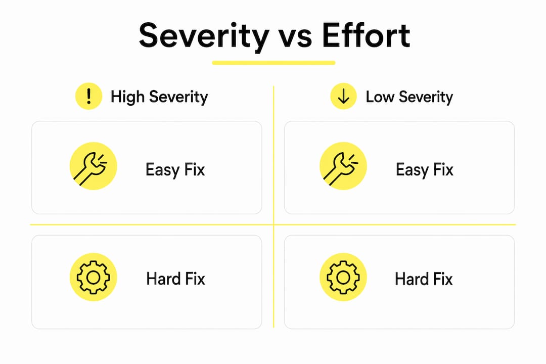
Once issues are identified, they are rated on two scales: severity and ease of fix. This dual rating is what makes audit reports useful rather than overwhelming. A focused audit of a mobile e-commerce checkout journey, for example, can be completed in approximately 3 days of structured review. That speed is only possible because the scope is defined tightly before the work begins.
Severity vs. effort prioritization matrix
| Severity | Ease of Fix | Priority |
|---|---|---|
| High | Easy | Fix immediately |
| High | Hard | Plan for next sprint |
| Medium | Easy | Quick win, schedule soon |
| Medium | Hard | Evaluate ROI before committing |
| Low | Easy | Batch with other small fixes |
Pro Tip: When you have a long list of audit findings, sort by high severity and easy fix first. These are your quick wins and they build momentum with stakeholders who need to see results before committing to larger changes.
What common UX issues do audits uncover?
The most damaging UX problems are rarely broken features. Silent conversion killers like weak visual hierarchy, buried trust signals, and unclear navigation degrade user experience on products that are technically functional. Users do not file support tickets about these issues. They simply leave.
Audits consistently surface the same categories of problems across different product types:
- Weak visual hierarchy: Users cannot identify the primary action on a page because competing elements share equal visual weight.
- Accessibility gaps: Missing alt text, low color contrast ratios, and non-keyboard-navigable components exclude users and create legal exposure.
- Unclear navigation: Menu labels that make sense to the internal team but confuse first-time users, causing drop-off before the core value is reached.
- Trust signal deficiencies: Missing social proof, unclear return policies, or absent security indicators at checkout that cause users to abandon at the final step.
- Inconsistent design patterns: Buttons that behave differently across screens, or form fields with varying validation logic, that increase cognitive load.
These issues compound over time. As a product adds features, the design inconsistencies multiply. UX debt is an inevitable byproduct of scaling, and the longer it goes unaddressed, the more expensive it becomes to fix. An audit gives you a clear picture of the debt before it reaches a critical level.
Pro Tip: Treat UX debt the same way you treat technical debt. Schedule a review every 6–12 months, especially after major feature releases, to catch inconsistencies before they compound into a full-scale usability problem.
Understanding how these issues connect to customer lifecycle stages helps product teams prioritize which friction points to address first based on where users are most likely to convert or churn.
How to conduct a UX audit: step-by-step
Running a UX audit without a clear process produces a list of opinions, not a product backlog. The steps below apply whether you are conducting the audit internally or commissioning it from an external team like Wallandfifth.
-
Define scope and objectives. Identify which user flows or product areas the audit will cover. A checkout funnel, an onboarding sequence, and a full product are three very different scopes. Narrow scope produces more actionable findings.
-
Collect baseline data. Pull analytics from Google Analytics, Hotjar, Mixpanel, or your analytics stack of choice. Identify the flows with the highest drop-off rates. These are your audit priorities.
-
Run the heuristic evaluation. Conduct heuristic evaluation first as a fast and effective method for detecting major UX flaws before committing to time-intensive usability testing. Evaluate each screen against established principles and document violations with screenshots and severity ratings.
-
Validate with usability testing if possible. Recruit 5–8 users who match your target profile and observe them completing key tasks. Usability testing confirms whether heuristic findings match real user behavior. It is not always feasible, but even two or three sessions add significant weight to your findings.
-
Rate findings by severity and ease of fix. Apply the dual-rating system to every issue. This step is what separates a useful audit from a document that gets filed and forgotten.
-
Build the prioritized report. Group findings by priority tier. Each finding should include a description of the issue, the evidence supporting it (screenshot, analytics data, or session recording), the severity rating, the ease-of-fix rating, and a recommended direction. The recommendation should point toward a solution category, not a finished design.
The most common mistake at this stage is letting personal preference enter the findings. Every recommendation must connect to a specific usability problem affecting a measurable outcome. If you cannot point to data or a recognized usability principle, the finding does not belong in the report.
You can find a practical walkthrough of this process in Wallandfifth’s website UX audit guide, which covers scope definition and reporting in detail.
How to apply UX audit findings to your product
An audit report is only valuable if it changes what gets built next. The severity and effort matrix from the audit maps directly to your product backlog. High-severity, easy-fix items go into the next sprint. High-severity, hard-fix items require scoping and resourcing before they can be scheduled.
A UX audit report built around a severity versus effort matrix prevents findings from being ignored. Without prioritization, a 40-item audit report overwhelms a product team and nothing gets fixed. With it, the team has a clear starting point and a defensible rationale for sequencing.
One critical boundary to maintain: a UX audit is purely diagnostic. It identifies what is broken and why, but it stops short of delivering design solutions. Clients who expect a finished redesign at the end of an audit will be disappointed, and that disappointment usually means the findings get deprioritized. Set this expectation before the audit begins.
The audit output feeds directly into design exploration. Once you know which flows are broken and why, you can brief a designer or design team with specific, evidence-backed problems to solve. That is a far more efficient starting point than a vague brief asking for a “better user experience.”
Pro Tip: Resist the urge to fix everything at once. Incremental improvements to high-priority flows, shipped and measured, produce more learning and more business impact than a large redesign that takes months to reach users.
For teams working on e-commerce products, Wallandfifth’s conversion optimization service applies audit findings directly to funnel performance, connecting UX issues to revenue impact.
Key Takeaways
A UX audit is the most direct path from a vague sense that your product underperforms to a prioritized, evidence-backed plan for fixing it.
| Point | Details |
|---|---|
| Audits are diagnostic, not prescriptive | An audit identifies what is broken and why; it does not deliver a finished redesign. |
| Heuristic evaluation is the core method | Expert review against usability principles is faster and broader than usability testing alone. |
| Severity and effort ratings drive action | Dual-rating every finding prevents audit reports from being ignored by overwhelmed teams. |
| UX debt compounds with scale | Regular audits every 6–12 months catch design inconsistencies before they erode conversion. |
| Data must back every finding | Recommendations without analytics or usability evidence are opinions, not audit findings. |
What I have learned from running UX audits on real products
The biggest misconception I see from founders and product managers is that a UX audit will hand them a new design. It will not, and it should not. The audit’s value is in the diagnosis. When a client comes to us with a product that is not converting, the instinct is always to redesign. But redesigning without understanding why the current product fails is expensive guesswork.
What audits consistently reveal is that the problem is rarely the visual design. It is almost always a structural issue: a navigation pattern that made sense at launch but broke as the product grew, a checkout flow with one too many steps, or a trust signal that was never added because the team assumed users would figure it out. These are fixable without a full redesign, and fixing them first produces measurable results faster.
The other thing I have learned is that stakeholder buy-in depends entirely on how the findings are presented. A list of 35 UX problems lands badly in a leadership meeting. A report that says “fix these three things in the next two weeks and your checkout completion rate should improve” lands very differently. The prioritization matrix is not just a planning tool. It is a communication tool.
Audits also change how product teams think about future development. Once a team has been through a structured audit, they start asking usability questions during feature scoping, not after launch. That shift alone is worth the cost of the audit.
— William
Wallandfifth’s approach to UX audits and product design
Wallandfifth works with founders and product teams who know their product has a problem but cannot pinpoint exactly what it is. We run structured UX audits that produce prioritized, evidence-backed findings, not a document full of design opinions.

From audit through to design and build, we cover the full product improvement cycle. If your product is underperforming and you need a clear picture of why, our product design for startups service is the right starting point. We also offer UX and UI design for teams that are ready to act on their findings. Every engagement is senior-led, fixed in scope, and focused on outcomes that connect to your business metrics.
FAQ
What is the UX audit definition in simple terms?
A UX audit is a structured expert review of a digital product that identifies usability problems, accessibility gaps, and friction points affecting user satisfaction and conversion. It is diagnostic, not a redesign.
How long does a UX audit take?
Scope determines duration. A focused audit of a single user flow, such as a mobile checkout journey, can be completed in approximately 3 days. A full product audit covering multiple flows typically takes one to three weeks.
What are common UX audit examples?
Common UX audit examples include reviewing a checkout funnel for drop-off causes, evaluating an onboarding flow against usability heuristics, and assessing a homepage for visual hierarchy and trust signal placement.
How is a UX audit different from usability testing?
A UX audit uses expert heuristic evaluation and analytics data to identify problems quickly. Usability testing observes real users completing tasks. Audits are faster and broader; usability testing adds depth but requires more time and resources.
Who should commission a UX audit?
Entrepreneurs and product managers whose products are underperforming on conversion, engagement, or retention metrics should commission a UX audit. It is also the right tool after major feature releases, when UX debt has likely accumulated.